Principles of animation for front end developers
Applying principles of animation to custom UI components can turn a stale, lifeless user interface into something much more visually engaging.
I built two separate versions of a joystick in React to demonstrate this. Both joysticks work the same way—grab the big red control knob in the center of the component and drag it around to produce a force vector.
Compare what happens when you interact with each one. Do you notice any difference?
Joystick - Version A
| Force | Theta |
|---|---|
| 0 | 0° |
Joystick - Version B
| Force | Theta |
|---|---|
| 0 | 0° |
If you're like most people, you probably think that Version A is much more visually appealing, and maybe even more realistic.
But why? Both of these UI components are composed of simple geometric shapes. Neither look like any joystick I've ever seen in the physical world. Where does that subtle feeling of satisfying realism come from?
Principles of animation
Version A of our React component has a better user experience because it is designed with an eye towards principles of animation. As discussed previously, following these principles helps animators draw more realistic-feeling animations by helping them visually imply that their creations adhere to basic laws of physics.

But as these joysticks demonstrate, these principles aren't just relevant to animators—as developers, we can use them to significantly improve our user interfaces.
While there are 12 principles in total, joystick A benefits from two in particular—anticipation and slow in and slow out.
Anticipation, in theory
When something in the real world is about to move, you can usually tell before it starts. The principle of anticipation reminds us that animations look more realistic if we signal our object's movements before they occur.
This manifests in different ways, but usually it takes the form of smaller, more subtle movements foreshadowing larger ones—a box wiggling and shaking for a moment before it explodes, for example.

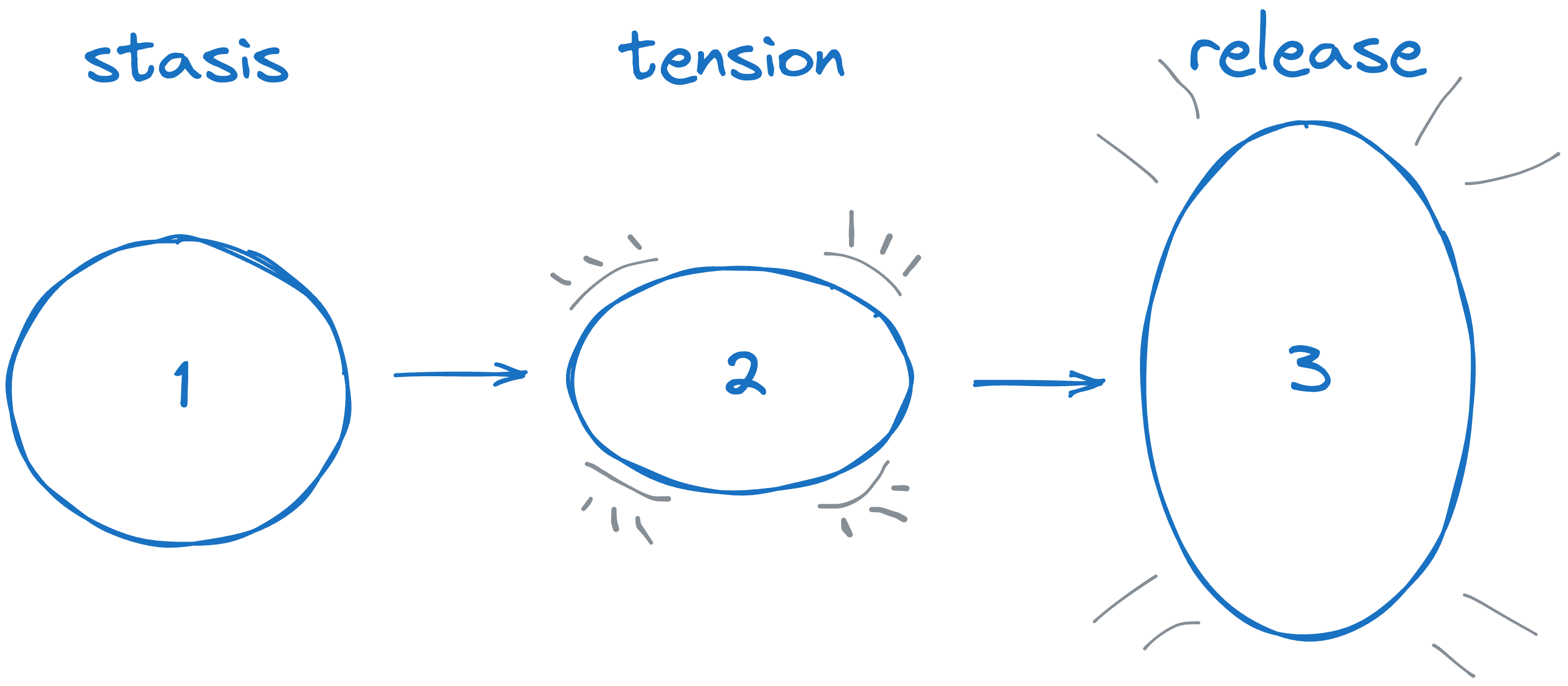
Anticipation can also be thought of as tension and release. The buildup to the action increases the tension, and the action itself resolves the tension by fulfilling the audience's built-up expectation for the foreshadowed action.
Anticipation, applied
Our React joystick uses anticipation in a subtle way to signal to the user that the joystick will snap back to the center of the component when the user releases the red blob.
Look closely at Version A one more time—as you pull the red ellipse farther away from the center of the component, three things change:
- The line between the center of the component and the ellipse gets thinner.
- The ellipse stretches along the line formed between it and the center of the component.
- The drop shadow behind the ellipse gets thicker.

Together, these changes imply that the component is stretching as it's pulled away from the center of the component, and will snap back to the center like an elastic when released. This visual effect is anticipation at work, making the component's reset animation more satisfying and realistic.
Slow in and slow out, in theory
The second principle of animation lending our joystick a sense of realism is slow in and slow out. This principle is all about motion and how it works in our physical world.
Objects at rest tend to stay at rest—so when they do move, they need a bit of time to accelerate. When they stop moving, they tend to do so gradually, decreasing their speed along a natural deceleration curve. The slow in and slow out principle reminds us to animate similarly.

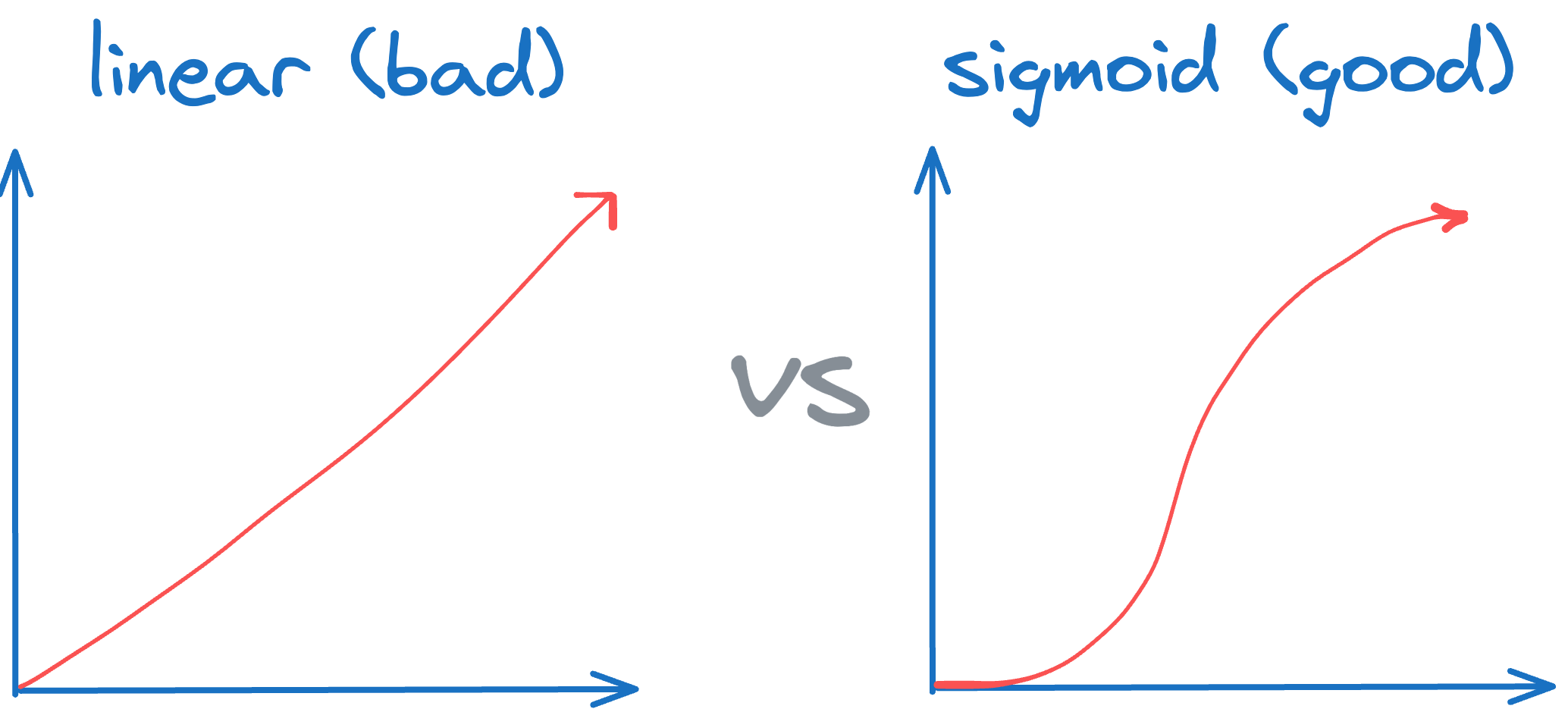
Mathematically, if we consider the speed at which things move over time, sigmoid functions tend to model this slow in and slow out dynamic pretty well. Look at the slope of the curve in the sigmoid graph above: it starts shallow, gets steeper, then steadily flattens out again.
The acceleration and deceleration curve of physical objects usually looks very similar to this. By using one of these curves as the basis for our animated motion we can more easily replicate that natural curve in our visualizations.
Slow in and slow out, applied
Slow in and slow out comes into play for our React component's behavior the moment the user releases the big red button.
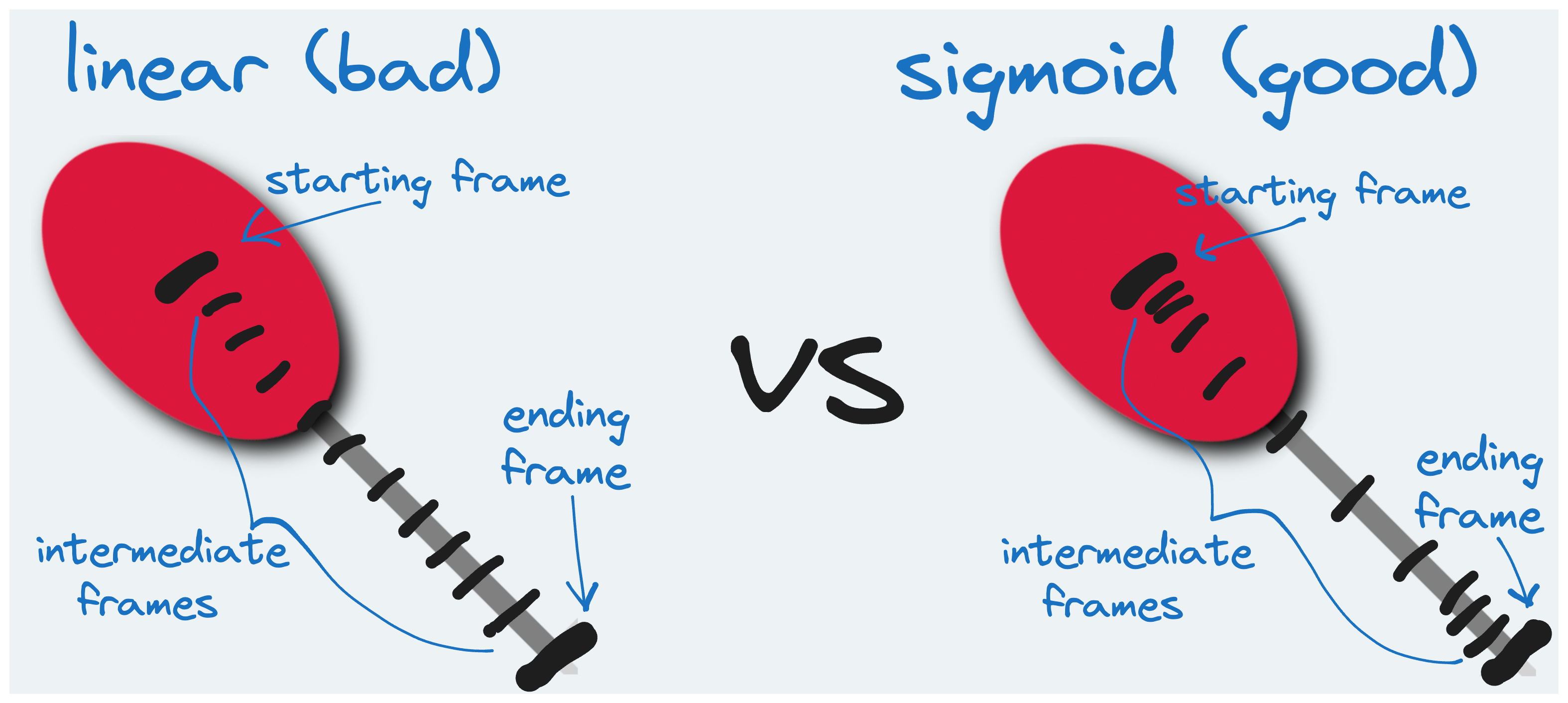
When this happens, the component animates the red ellipse back to the center of the component, one frame at a time. Each frame moves the ellipse a bit closer to the center until it's back at the center and the animation completes.

The difference in this regard between Version A and Version B is the distance between the frames.
In Version B, each frame is spaced equally apart—to compute the intermediate (x, y) positions, our component simply interpolates linearly between the starting and ending values in each dimension.
export const linearComputeFramePositions = (start: number, end: number): number[] => {
    let intermediatePositions = [];
    const diffPct = (end - start) / 12;
    for (let i = 0; i < 12; i++) {
        intermediatePositions.push(start + ((i+1) * diffPct));
    }
    return intermediatePositions;
}
In Version A, however, our component computes these intermediate positions non-linearly—specifically, it uses a flavor of Math.atan, which is a sigmoid function:
export const sigmoidComputeFramePositions = (start: number, end: number): number[] => {
    let intermediatePositions = [];
    const diff = end - start;
    for (let i = 0; i < 30; i++) {
        let percent = Math.min(Math.atan(0.75*i) / Math.atan(0.75*30) + 0.1, 1);
        let intermediatePosition = start + (percent * diff);
        intermediatePositions.push(intermediatePosition);
        if (percent === 1) {
            break;
        }
    }
    return intermediatePositions;
}
This simple change makes the animation significantly more satisfying. In Version A, the ellipse snaps back to the center as if pulled in by an elastic band, just as we'd signaled our user to anticipate as they pulled it away from its original position.
Skeuomorphism lives!
Skeuomorphism is central to our narrative of how UI design has progressed over the last decade. As the story goes, we started by building interfaces that looked like real-world objects, then progressed to more 'digitally native' user experiences over time.
But even in today's digital-first UI design languages, echoes of our physical world persist. If you're building an abstract, computerized version of a joystick, your users will have much better experiences with it if your design uses principles of animation to suggest to users that your web-first joystick abides by basic laws of physics.
In other words, while this web joystick doesn't look like a real joystick, it's still better if it feels like one.